In this chapter, we will show the figure generation for the multiple subject analysis.
Step1. Open the Figure Module
In the folder of rawdata1, selected the datasets
- avg Sub001 P300 nontarget
- avg Sub001 P300 target
Click “Figure->General Figure creator” to open the figure module with a blank canvas.
Step2. Create the Subfigures
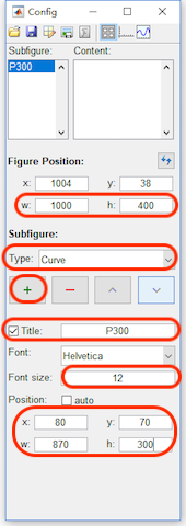
- Set the width and height of the Figure as 1000 and 400.
- Add a curve with the title P300, font size 12, and position x=80, y=70, w=870 and h=300.
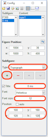
- Add a topography with the title 0 ms, font size 12, and position x=100, y=180, w=120 and h=120.
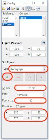
- Add a topography with the title 332 ms, font size 12, and position x=230, y=180, w=120 and h=120.
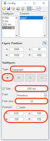
- Add a topography with the title 500 ms, font size 12, enable the colorbar in the content panel and position x=100, y=180, w=120 and h=120.
Step3. Add the Content
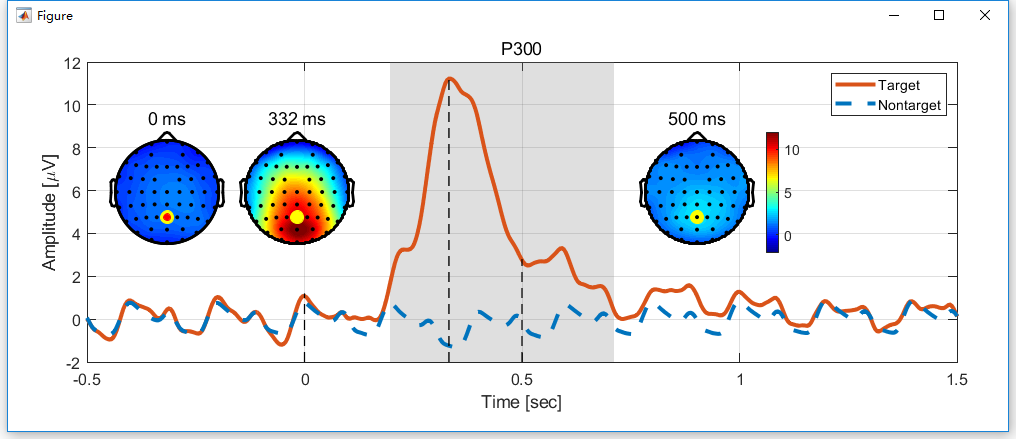
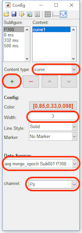
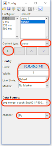
- Click the content button in the toolbar, select P300 in the Subfigure. Add a curve with width as 3,the data source as “avg merge_epoch Sub001 P300 target” and channel as Pz.
- Add a curve with the color as blue [0,0.45,0.74], width as 3, Line style as dashed, data source as “Sub093 P300 nontarget” and channel as Pz.
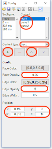
- Add a rect with face opacity 0.25, edge opacity 0, position x = 0.196, y= -2, w = 0.516, and h = 14. And sort the rect above the curve1 and curve2.
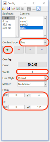
- Add a line with width as 1, line style as dashed, and the position as x1=0, y1=-2, x2=0 and y2=1.2.
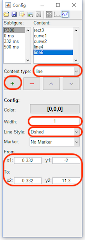
- Add a line with width as 1, line style as dashed, and the position as x1=0.332, y1=-2, x2=0.332 and y2=11.3.
- Add a line with width as 1, line style as dashed, and the position as x1=0.5, y1=-2, x2=0.5 and y2=2.8.
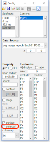
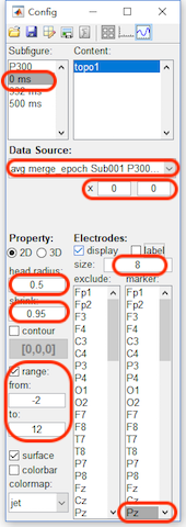
- Select 0 ms in the Subfigure. Set the data source as “avg merge_epoch Sub001 P300 Target”, x from 0 to 0, head radius as 0.5, shrink as 0.95, range from -2 to 12 to keep it the same as the range of P300 curve. For the electrodes, set the size as 8 and marker the channel Pz.
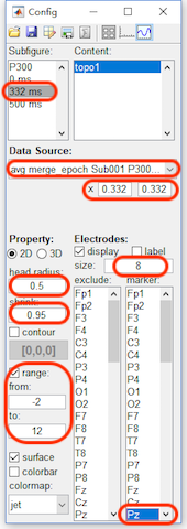
- Select 332 ms in the Subfigure. Set the data source as “avg merge_epoch Sub001 P300 Target”, x from 0.332 to 0.332, head radius as 0.5, shrink as 0.95, range from -2 to 12 to keep it the same as the range of P300 curve. For the electrodes, set the size as 8 and marker the channel Pz.
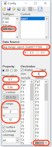
- Select 500 ms in the Subfigure. Set the data source as “avg merge_epoch Sub001 P300 Target”, x from 0.5 to 0.5, head radius as 0.5, shrink as 0.95, range from -2 to 12 to keep it the same as the range of P300 curve. For the electrodes, set the size as 8 and marker the channel Pz.

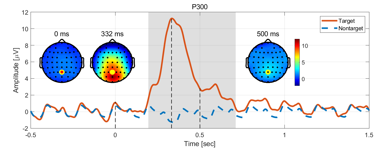
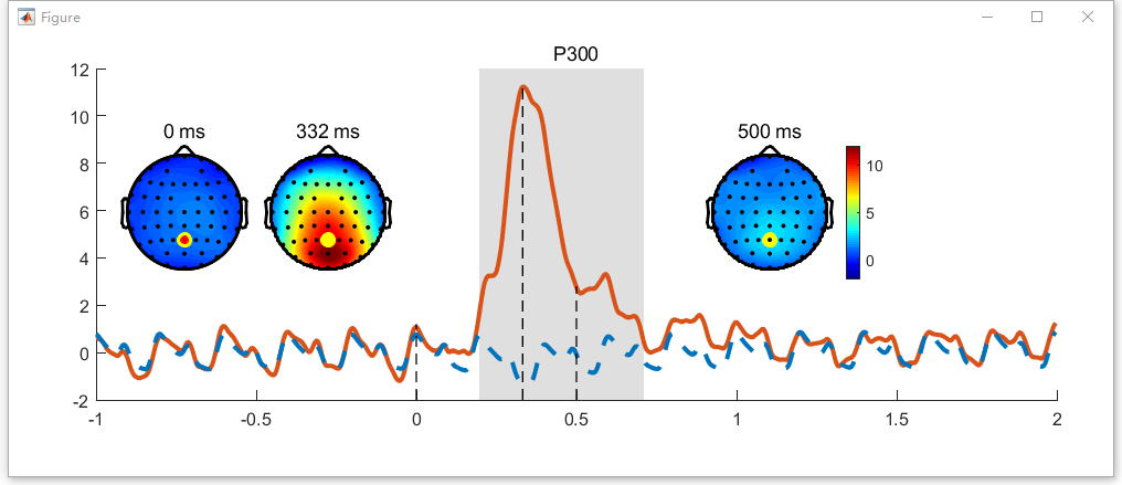
After step 3, the figure will be like the following figure,
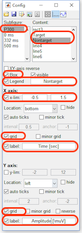
Step4. Set the axis parameters
- Click the axis button in the toolbar, select P300 in the Subfigure. and enable the Box and Legend.
- Select curve1 in the listbox of the content, change its name to Target in the legend. Select curve2 in the listbox of the content, change its name to NonTarget in the legend.
- For x axis, set the x-lim from -0.5 to 1.5 second. Enable the grid and the label, set label as “Time [sec]”.
- For y axis, enable the grid and the label, set the label as “Amp [\muV]“
After step 4, the figure will be like the following figure. Here we did not export it to the external software for the further editing.